SIGNAL
An identity for a space for art, sound and performance.
SIGNAL is a cultural space on Hanbury Street in East London. Bringing together exhibitions, talks, workshops and a broadcast room, it gives artists and audiences a place to encounter new work.
I created an identity that connects SIGNAL’s varied programs while giving each one a distinct visual presence. Built around a custom wordmark and a generative image system, the identity extends across print, wayfinding, motion and a website I designed and coded.
- Project
- Studio work
- Role
- Creative direction, brand identity, motion, web design and creative coding
- Year
- 2026
The identity
A shared system for different programs.
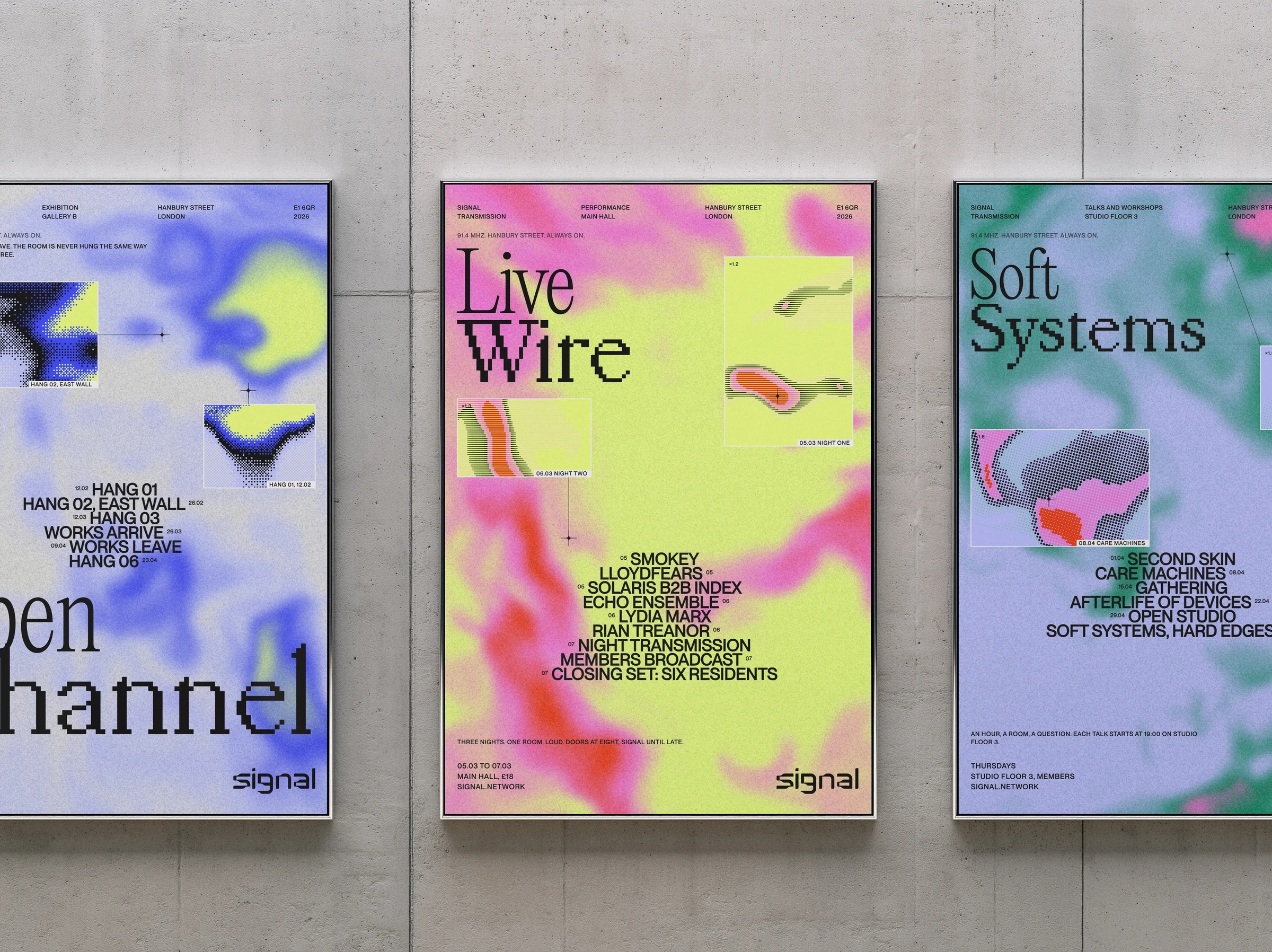
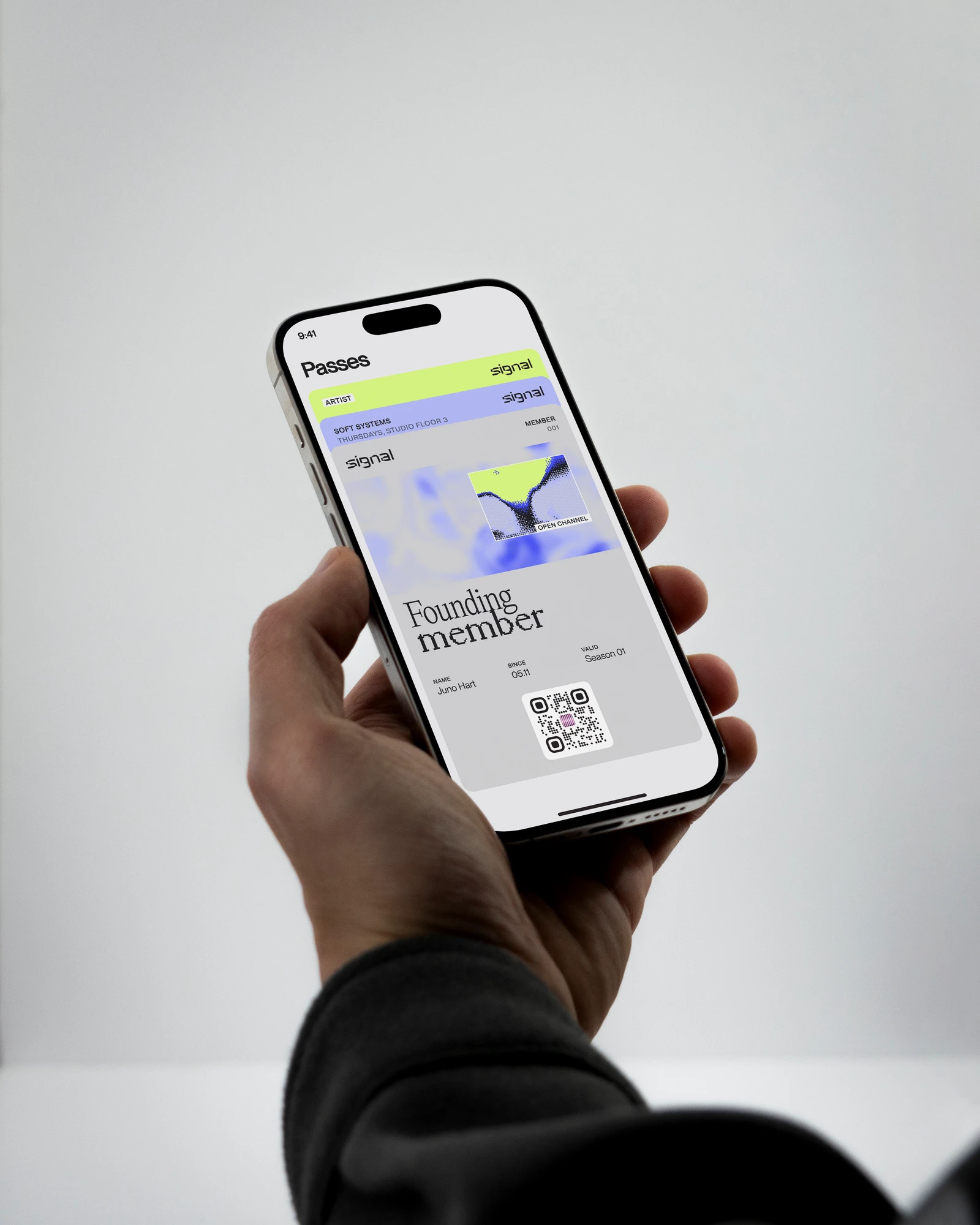
The identity combines blurred fields of color with sharp, processed imagery. Each program has its own palette and image treatment, while a shared approach to type, layout and motion brings the season together.
The season
Three programs. Three visual expressions.
The first season brings together an exhibition, a performance program and a series of talks.
Open ChannelThe exhibition program pairs cool blues with dithered imagery.
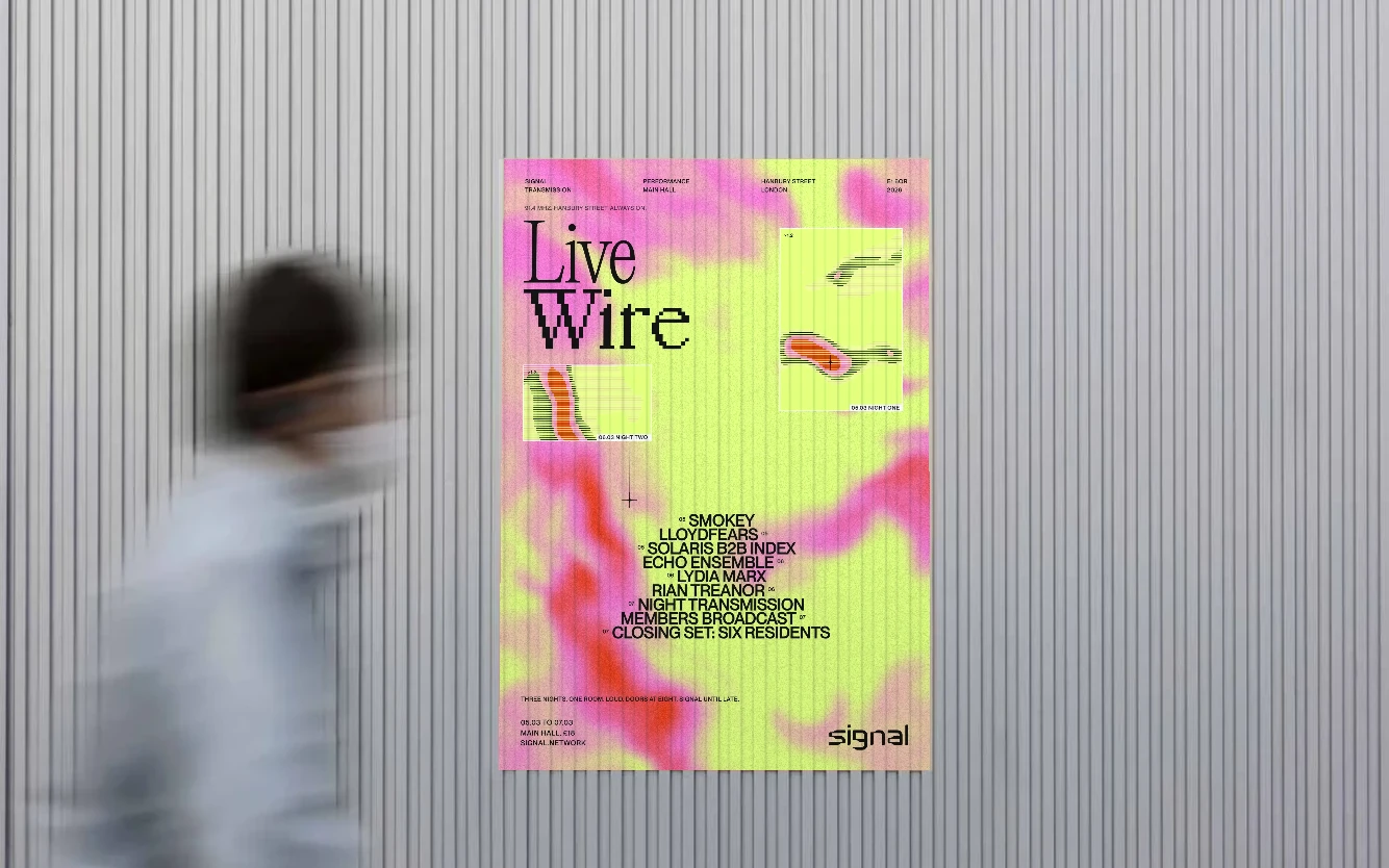
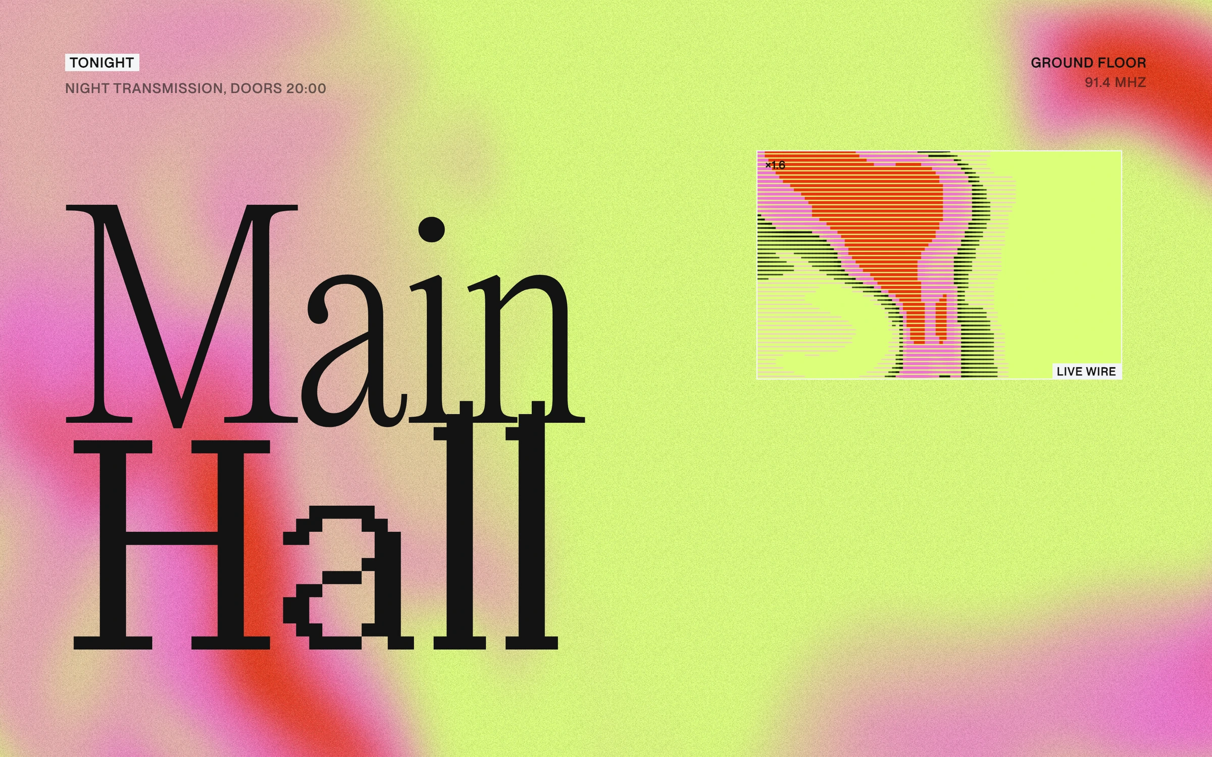
Live WireThe performance program uses lime, pink and red with horizontal scan lines.
Soft SystemsThe talks program combines green and lavender with halftone imagery.
The engine
Imagery in motion.
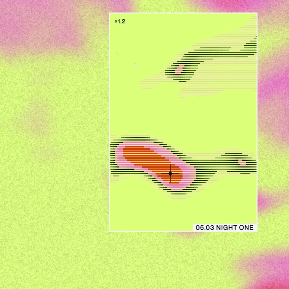
I coded a JavaScript engine that generates moving fields of color. A window displays a processed version of the image using one of three treatments: dither, scan or halftone.
The engine produces imagery for the identity and runs live on screen. Visitors can move the window and switch between treatments to explore the system.







The wordmark
A custom mark for SIGNAL.
The wordmark is built from custom letterforms that widen and narrow along their strokes. Rounded corners and changing proportions give it a distinctive shape across print, screens and the space itself.
Type and color
Two typefaces. Three palettes.
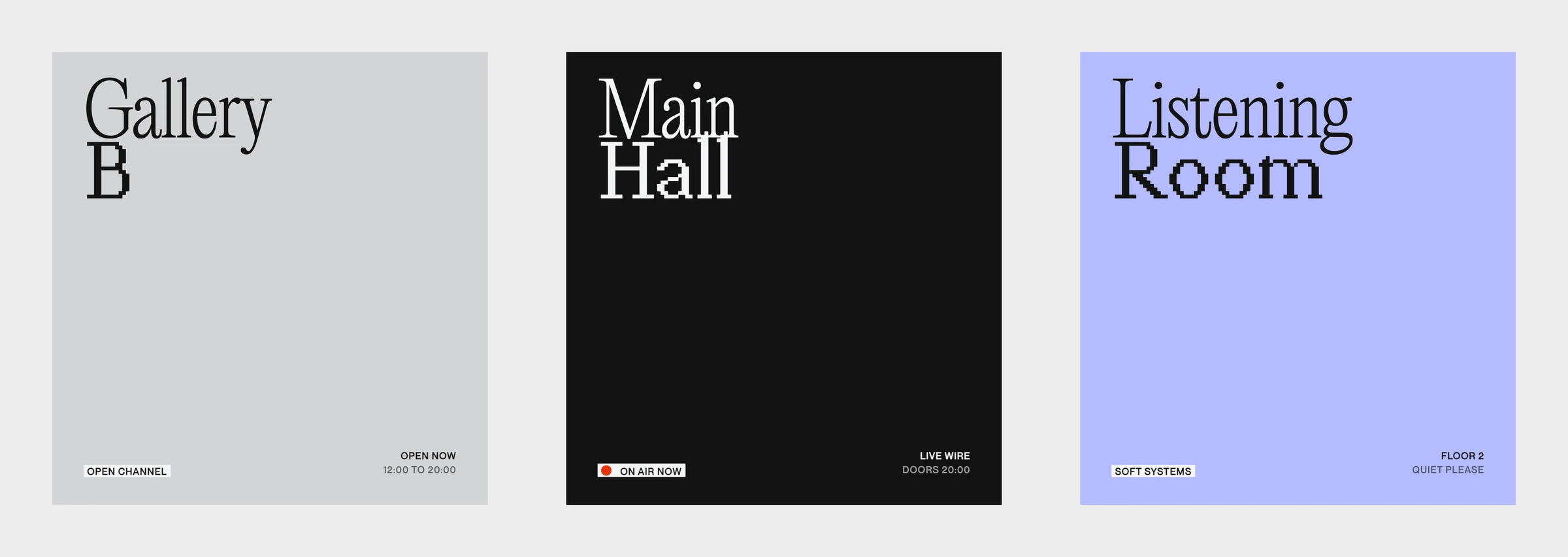
An expressive serif is paired with a pixel typeface, bringing the contrast between soft and sharp into the typography.
A shared gray ground anchors the identity. Each program has its own palette, creating a clear distinction across the season.
In the world
Across print, screens and space.
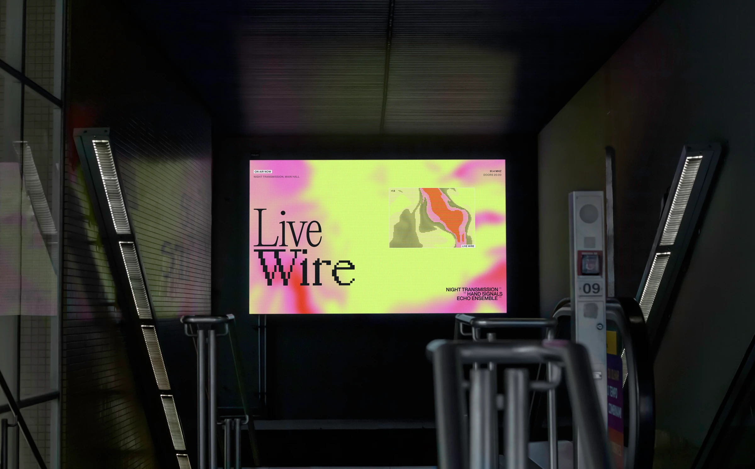
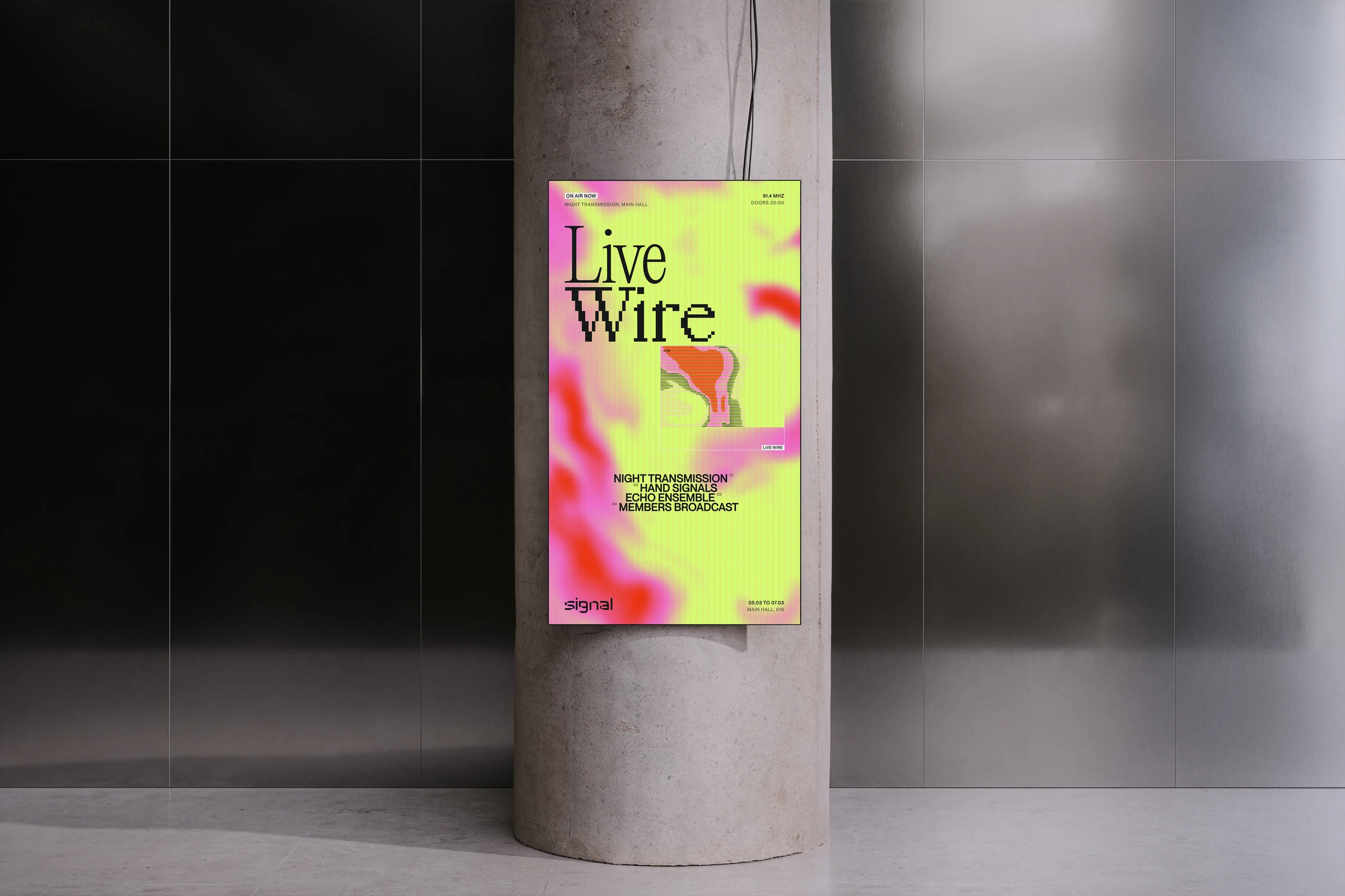
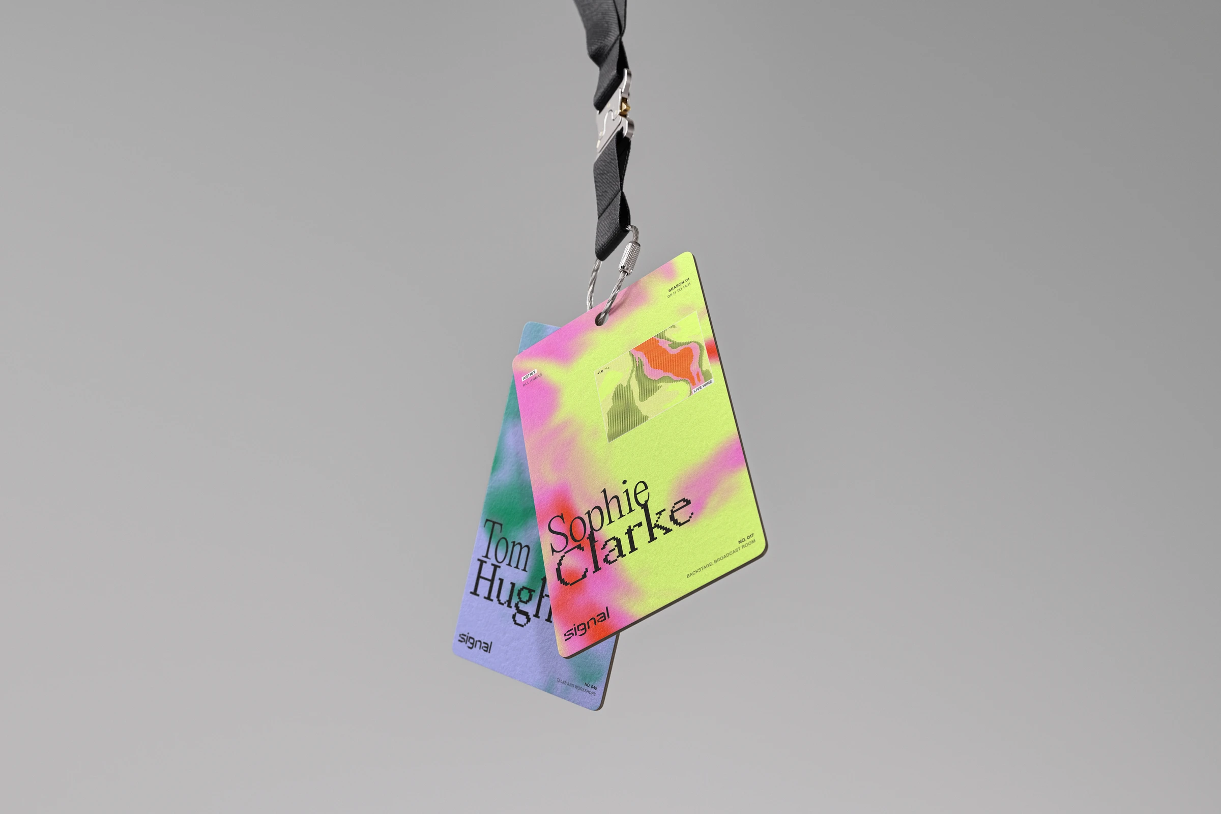
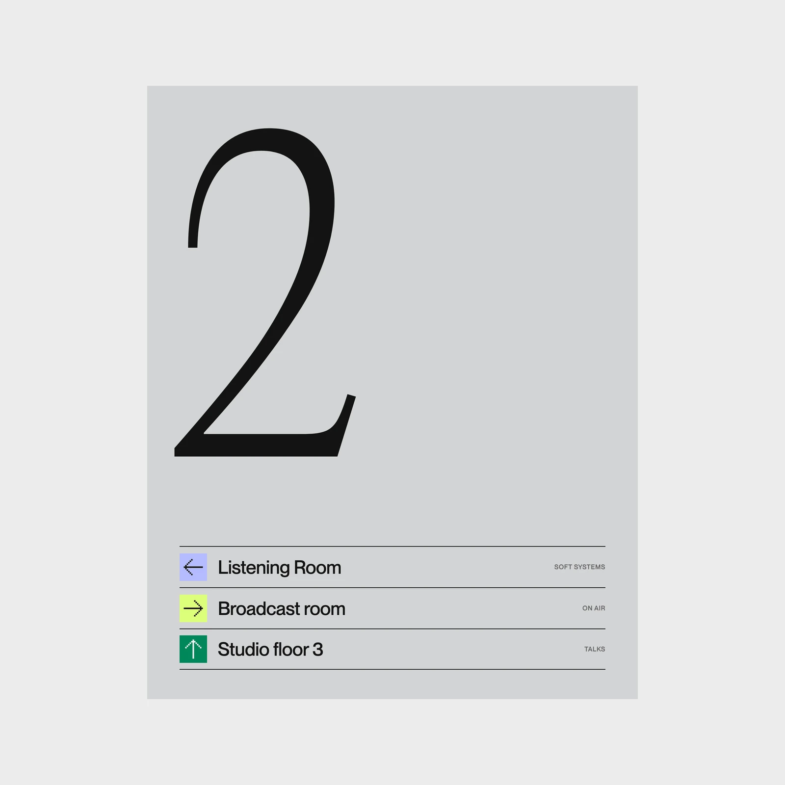
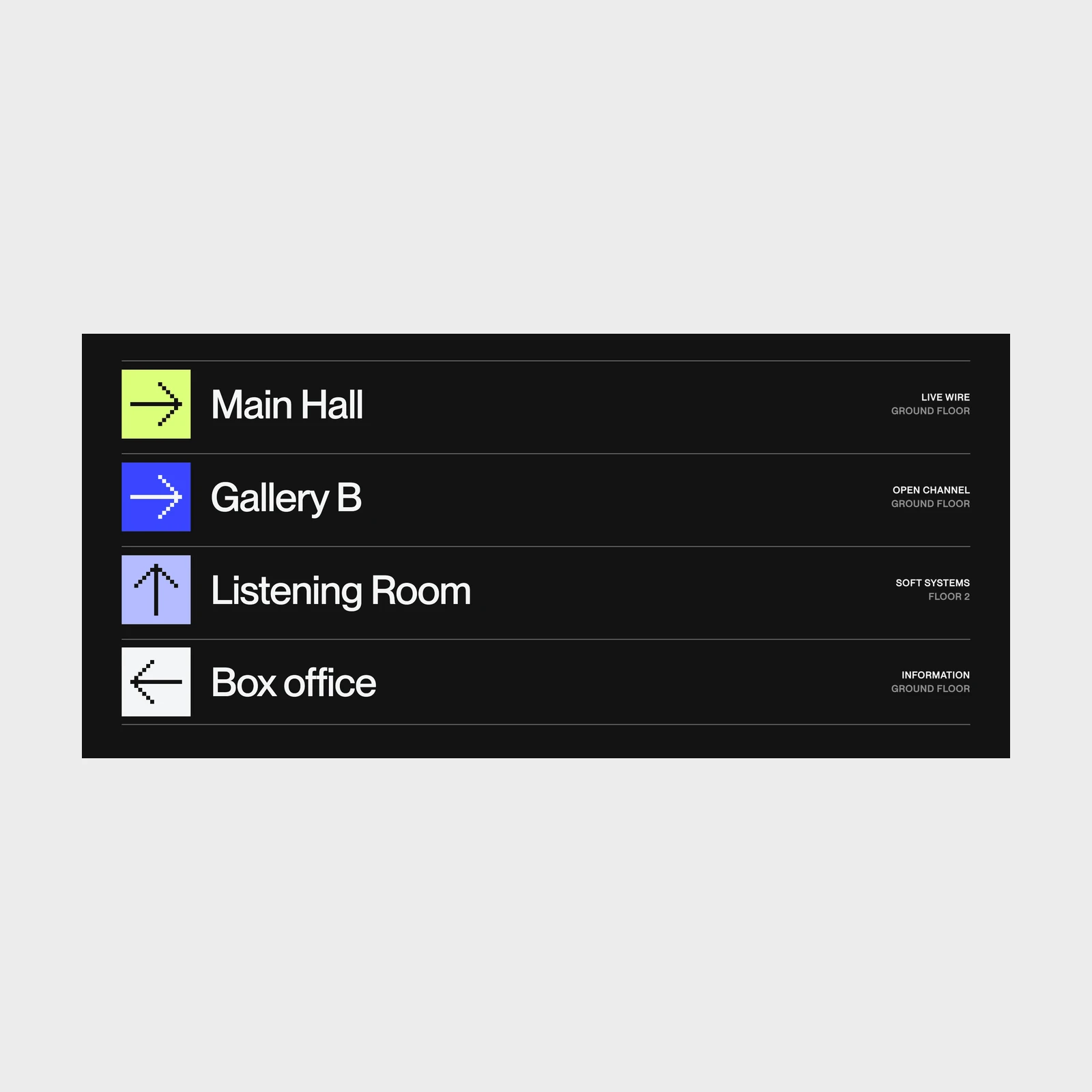
The identity extends from posters and the printed program to digital displays and wayfinding. Shared elements keep each application connected, while the system adapts to different formats and information.
The website
A digital home for SIGNAL.
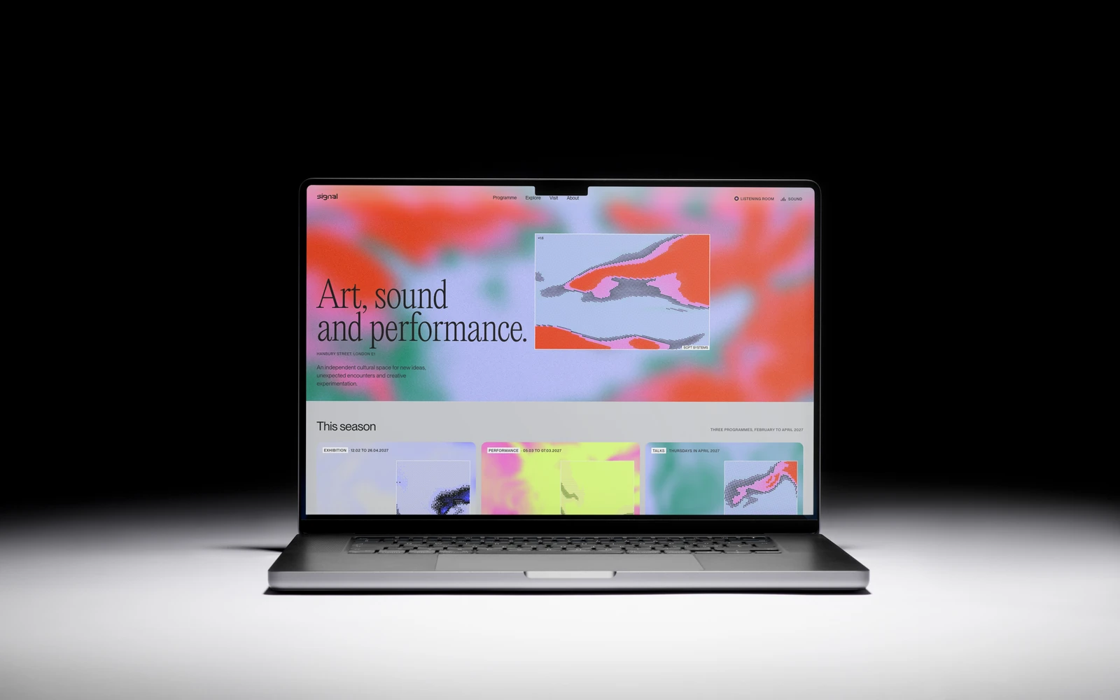
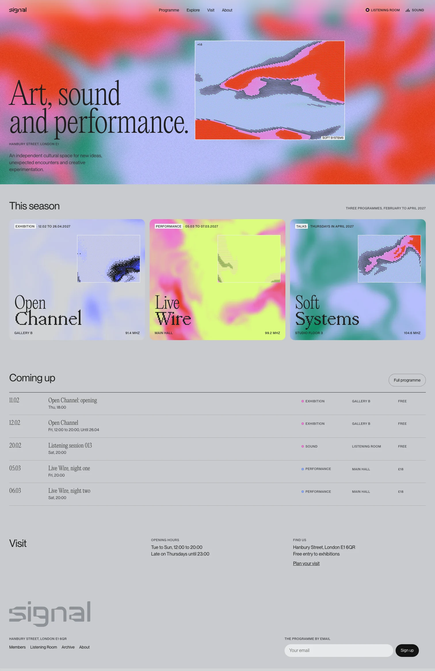
I designed and coded a website for exploring the program and finding upcoming events. Each program has its own colors and imagery within a shared layout.
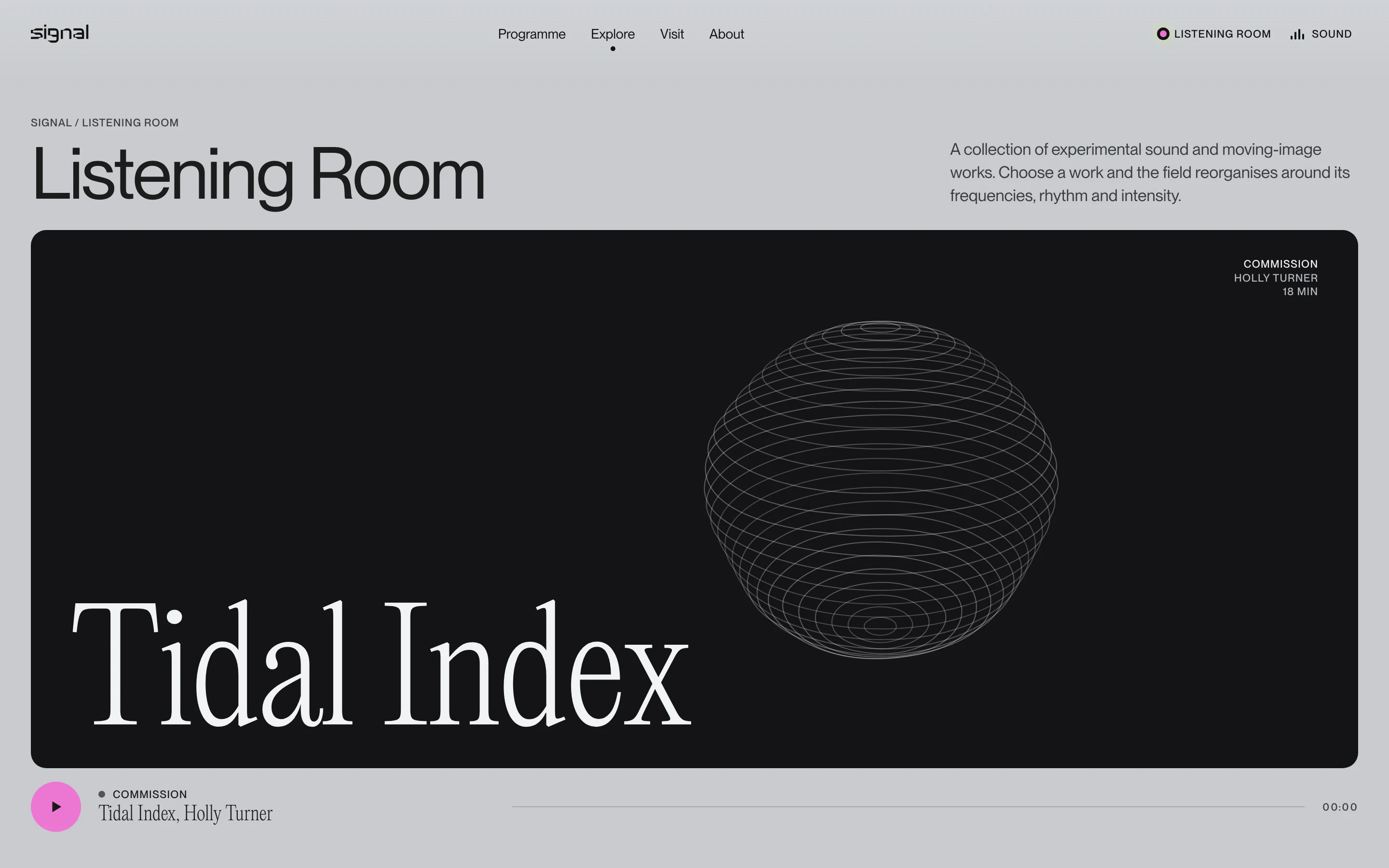
The Listening Room
The Listening Room is an online collection of experimental sound and moving-image work. Visitors can choose a work and experience it alongside a visual field that responds to its frequencies, rhythm and intensity.
Deliverables
- Concept and naming
- Logotype and mark
- Brand guidelines
- Program posters
- Out of home
- Wayfinding
- Print objects and vinyl
- Social
- App and sign-up
- Website
- Motion system